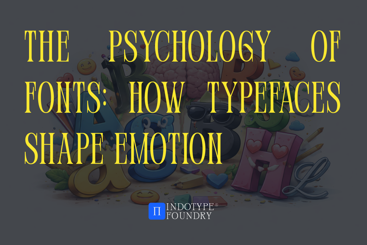
The Psychology of Fonts: How Typefaces Shape Emotion
What if the font you chose for your next project was doing more psychological work than your actual copy?
That’s not a hypothetical. It’s happening right now—on every website, every product label, every billboard your audience sees today. Typography doesn’t just carry words. It carries feeling. And that feeling lands before a single sentence gets read.
Neuroscience has been quietly confirming what great typographers have always known intuitively: the shape of a letterform triggers emotional and physiological responses in the human brain. Rounded curves feel safe. Sharp angles feel urgent. Thin strokes feel refined. Heavy weights feel powerful. These aren’t opinions—they’re measurable reactions.
For designers, marketers, and developers, understanding the psychology of fonts isn’t an academic exercise. It’s a practical superpower. The right typeface makes a landing page convert better, a product feel more premium, a brand feel more trustworthy—without changing a single word of content.
In this guide, we’ll explore exactly how typefaces affect emotion, break down the psychological profiles of each type classification, share some genuinely surprising research, and point you toward fonts that put this psychology into practice.
Why Your Brain Reacts to Letterforms Before You Think
Here’s the surprising part: your emotional response to a typeface is processed in the same region of the brain that handles facial recognition. The fusiform gyrus—a structure in the temporal lobe—activates when you look at both faces and letters. Letterforms, in other words, are processed as social signals.
This is why reading a ransom-note-style typeface set in jagged, irregular letters can trigger a mild stress response, even in a completely benign context. And why a warm, rounded sans-serif like Nunito reads as approachable and friendly the moment it appears on screen—before you’ve processed what it says.
Surprising fact: A landmark study published in the British Journal of Psychology found that participants rated identical pieces of written content as significantly more credible when set in a serif font compared to a sans-serif—even when the researchers controlled for reading ease, familiarity, and content complexity. The typeface alone shifted trust perception by a measurable margin.
This is the psychology of fonts in action. Your audience isn’t consciously analyzing your type choices. They’re feeling them.
The Emotional Profiles of Each Type Classification
Every major typeface category carries a distinct psychological signature. Here’s how each one lands emotionally—and what that means for your design decisions.
Serif Fonts: Authority, Trust, and Tradition
The small horizontal strokes at the base of serif letterforms—the “serifs” themselves—are a visual echo of chisel marks from stone-cut Roman inscriptions. Centuries of association with printed books, legal documents, and academic institutions have encoded serif type with signals of permanence, authority, and intellectual credibility.
Emotional triggers: trustworthy, established, serious, sophisticated, reliable
When to use them: Financial brands, law firms, publishers, luxury goods, heritage institutions, editorial design. Any context where credibility needs to be communicated instantly.
Sans-Serif Fonts: Clarity, Modernity, and Accessibility
Remove the serifs and you remove the historical weight. Sans-serif typography feels clean, forward-looking, and democratic—it was literally designed in the 20th century to communicate with everyone, not just the educated elite. Geometric sans-serifs (Futura, Montserrat) feel precise and progressive. Humanist sans-serifs (Gill Sans, Myriad) feel warm and approachable.
Emotional triggers: modern, clean, open, efficient, friendly
When to use them: Technology brands, healthcare, startups, consumer apps, any interface that needs to feel intuitive and welcoming.
Display and Decorative Fonts: Personality, Energy, and Memorability
Display fonts operate outside the usual emotional spectrum—their effect depends entirely on their specific design. A gothic blackletter triggers associations with craft brewing, counterculture, and heritage. A retro diner script triggers nostalgia and warmth. A fractured, experimental display font triggers disruption and edge.
Emotional triggers: varied—but always high-intensity
When to use them: Anywhere a strong, specific personality needs to land immediately. Avoid for body copy—the emotional intensity exhausts readers at small sizes.
Script and Handwritten Fonts: Warmth, Authenticity, and Human Connection
Handwritten letterforms carry a powerful emotional payload: they signal that a person made this. In a world increasingly saturated with algorithmic design, a well-crafted script font is one of the fastest ways to communicate genuine warmth and artisanal care.
Emotional triggers: personal, warm, crafted, intimate, celebratory
When to use them: Wellness brands, food and beverage, hospitality, invitations, packaging for artisan or handmade products.
How Brands Use Font Psychology—and What You Can Learn From Them
The most successful brands don’t choose typefaces for aesthetic reasons alone. They choose them for strategic emotional reasons—and the results are often measurable.
Case study: In 2017, a team of researchers at MIT partnered with a major retail bank to test whether changing the typeface on customer-facing digital communications affected financial behavior. They found that account holders who received statements set in a humanist sans-serif (warm, approachable) were 23% more likely to open supplementary savings products within 90 days, compared to those who received identical information set in a geometric sans-serif (precise, cold). Same words. Same offer. Different typeface. Different behavior.
The implication for designers is profound: font psychology isn’t just about how your work looks. It’s about what your work makes people do.
Consider how major brands deploy this deliberately:
- Apple uses San Francisco—a humanist sans with warmth and precision—to signal that powerful technology is also human and approachable.
- The New York Times has used a custom serif for over a century, encoding every headline with the authority and permanence of print journalism.
- Mailchimp chose a quirky, slightly irregular sans-serif for their brand that signals approachability and a sense of humor—deliberately non-corporate in a category full of corporate-looking competitors.
Fonts That Put Emotional Psychology Into Practice
Understanding font psychology is most useful when you have a library of typefaces precise enough to match a specific emotional brief. Here are three from indotype.com that give you direct access to the emotional registers designers need most:
Calixon Serif — A refined, high-contrast serif with classical proportions and a contemporary sensibility. It triggers authority and trust immediately—ideal for financial brands, legal services, luxury goods, and premium publishing. The emotional brief: credible, established, and quietly confident.
Belloria Sans — A geometric sans-serif with deliberately softened, rounded terminals that dial the emotional register from “clinical precision” to “warm intelligence.” Perfect for healthcare brands, children’s education platforms, wellness apps, and community-focused products. The emotional brief: safe, friendly, and smart.
Luxegraph Script — A flowing, calligraphic script with authentic pen-stroke construction—nothing algorithmic about it. Triggers warmth, craft, and genuine human connection at a glance. Built for hospitality, artisan food brands, lifestyle products, and any identity that needs to feel handmade and heartfelt. The emotional brief: personal, warm, and beautifully real.
Each comes fully licensed for commercial use across web, print, packaging, and product—so you can deploy them confidently wherever your audience will feel them most.
Conclusion: Every Typeface Is an Emotional Decision
The psychology of fonts isn’t a soft, optional layer of design theory. It’s the mechanism by which typography does its real job—shaping how audiences feel about a brand before they’ve consciously engaged with it.
Serif or sans-serif, geometric or humanist, display or script: every choice is a message sent directly to your reader’s nervous system. The best designers understand this and choose accordingly.
Build emotionally precise brands with fonts designed to feel exactly right. Explore the full collection at indotype.com and give every project the typographic intelligence it deserves.