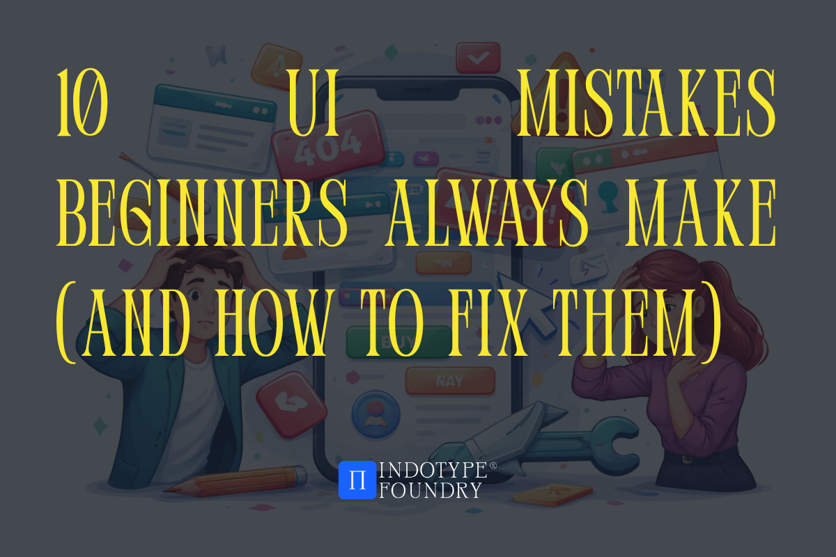
10 UI Mistakes Beginners Always Make (And How to Fix Them)
Every great UI designer has a graveyard. A folder somewhere filled with early projects that committed the exact same crimes—text too small, contrast too low, fonts that clash like strangers at a dinner party, buttons that nobody wanted to click.
Here’s the uncomfortable truth: most UI mistakes aren’t random. They follow predictable patterns. Beginners make the same errors in the same order because they’re optimizing for how a design looks in isolation rather than how it functions in the hands of a real user.
And typography is at the center of more UI mistakes than any other design element. A 2024 study by the Nielsen Norman Group found that typography-related issues accounted for 38% of all usability failures in beginner UI portfolios reviewed by senior UX professionals. Not layout. Not color. Type.
Whether you’re a junior designer building your first app interface, a developer who’s taken on UI responsibilities, or a marketer creating digital assets without a dedicated design team—this guide will help you spot the ten most common UI mistakes, understand why they happen, and fix them with practical, immediately applicable solutions.
Mistakes 1–3: The Typography Traps
Mistake 1: Using Too Many Fonts
Walk into any beginner UI portfolio review and you’ll find it within the first thirty seconds—five different typefaces fighting for dominance on a single screen. A bold display font for the headline, a script for the subhead, a geometric sans for the body, a slab serif for the CTA button, and something decorative in the footer for reasons nobody can explain.
More fonts does not mean more personality. It means less control.
The fix: Limit yourself to two typefaces maximum in any UI project—one for display and headlines, one for body copy and interface labels. Choose fonts with strong weight ranges so you can create hierarchy through weight and size, not by adding more typefaces. A single well-chosen variable font can do the work of an entire family.
Mistake 2: Body Text That’s Too Small
The default assumption for many beginners is that small text looks “clean” and “minimal.” In practice, body text below 16px on screen forces users to strain, increases bounce rates, and creates accessibility failures that can expose products to legal risk.
The fix: Set your body copy minimum at 16px for desktop interfaces and 15px for mobile. Never go below these thresholds for any text users are expected to read—not even for captions, helper text, or legal copy. Use size contrast intentionally: big headlines, readable body copy, and clearly differentiated supporting text that scales gracefully.
Mistake 3: Ignoring Type Hierarchy
When everything is the same size, nothing is important. Beginners frequently set headlines, subheads, body copy, and labels at nearly identical sizes because they’re focused on visual neatness rather than communicative clarity. The result is an interface where users can’t tell where to look first.
The fix: Establish a clear typographic scale before you design a single screen. A basic scale might use 48px for display headlines, 32px for section headers, 24px for subheads, 16px for body, and 13px for labels. Stick to it. Every text element should occupy exactly one level of your hierarchy—no exceptions.
Fonts for UI design that make hierarchy effortless:
Behame Grotesk from indotype.com — A contemporary grotesque inktrap with seven weights and optical size-specific spacing built right in. At display sizes it has personality and presence; at body sizes it’s quietly exceptional. One typeface, full hierarchy range, commercially licensed for web and app use.
Mistakes 4–6: The Layout and Spacing Errors
Mistake 4: Inconsistent Spacing
Beginners almost universally treat spacing as decoration—adding padding where things feel too tight and removing it where screens feel crowded. The result is an interface with no internal rhythm, where elements seem to float without logic.
The fix: Choose a base spacing unit (8px is the industry standard) and build your entire spacing system as multiples of it: 8, 16, 24, 32, 48, 64px. Apply this consistently to margins, padding, gaps between components, and section spacing. Consistent spacing is invisible when done right—and immediately obvious when done wrong.
Mistake 5: Insufficient Color Contrast
This is the accessibility failure that appears most frequently in beginner work—light grey text on a white background, white text on a pale yellow button, low-contrast placeholder text that users simply can’t read in anything less than perfect lighting conditions.
The fix: Use the WCAG AA contrast ratio standard as your minimum—4.5:1 for body text, 3:1 for large text and UI components. Test every text-on-background combination using a contrast checker before you ship. Tools like the Colour Contrast Analyser or the built-in accessibility checks in Figma make this a thirty-second task, not a design constraint.
Mistake 6: Centering Everything
Center alignment feels safe. It looks balanced in isolation. But beginners who center-align entire interfaces—headlines, body copy, navigation, cards, everything—create layouts that are exhausting to read and visually unanchored.
The fix: Center alignment is a display choice, not a default. Use it for short headlines, hero statements, and isolated decorative text. Everything else—body copy, UI labels, list items, form fields—should be left-aligned. Left alignment creates a consistent reading edge that the eye can return to naturally, reducing cognitive load with every line.
Surprising fact: Eyetracking research from the Baymard Institute found that center-aligned body text on product pages increased average reading time by 19%—not because users were more engaged, but because they were working harder to track each line. Harder to read always means fewer conversions.
Mistakes 7–9: The Interaction and Visual Polish Mistakes
Mistake 7: Buttons That Don’t Look Clickable
A button that blends into its surrounding layout is a conversion killer. Beginners often underdesign CTAs—making them too small, too low-contrast, or so visually similar to non-interactive elements that users genuinely can’t tell they’re clickable.
The fix: Your primary CTA button should be the most visually prominent interactive element on any screen. Use strong color contrast, generous padding (at least 12px vertical, 24px horizontal), clear button labels set in a readable weight (medium or semibold, not light), and consistent hover/active states that confirm interactivity. If users have to guess whether something is a button, it’s failing.
Mistake 8: Overusing Drop Shadows and Gradients
Visual effects applied without intention are the typographic equivalent of using twelve fonts—they signal effort without communicating purpose. Beginners reach for drop shadows, heavy gradients, and glow effects when they want something to “pop,” but layered effects create visual noise rather than hierarchy.
The fix: Use elevation effects (shadows, gradients) to communicate meaning—a floating modal sits above the page, a card lifts on hover to signal interactivity, a bottom navigation bar separates from content. If an effect doesn’t communicate something functional, remove it. Restraint is always more sophisticated than decoration.
Mistake 9: Neglecting Empty States and Edge Cases
Beginners design for the ideal scenario—the screen full of content, the form already filled, the dashboard populated with data. Real users encounter empty states, error messages, loading screens, and zero-result searches constantly. Leaving these states unstyled or undesigned creates jarring experiences that break the illusion of a polished product.
The fix: Design every empty state intentionally. An empty inbox, a zero-result search, a first-login dashboard—each one needs a clear message, a visual that maintains brand personality, and a clear action that guides the user forward. These moments are often where a product’s personality shines most clearly.
Fonts for UI polish that perform in every state:
Monetic Sans from indotype.com — A refined geometric sans with exceptional legibility at small UI sizes and genuine warmth at display scales. Its consistent optical rhythm makes it equally at home in an error message, a loading label, and a hero headline. The full-family commercial license covers web, app, and interactive media.
Mistake 10: Designing Without a Real Type System
This is the mistake that makes all the others worse. Beginners frequently select fonts at the project level—picking something that looks good for the first screen—without establishing a coherent type system that governs every text element across every screen. The result is a product that looks inconsistent, feels unfinished, and requires constant manual decisions that should be automatic.
The fix: Before you design screen one, define your complete type system: typeface(s), size scale, weight assignments per hierarchy level, line height ratios, letter spacing adjustments, and alignment rules. Document it. Apply it everywhere. This is what the difference between a portfolio piece and a production-ready product looks like.
Case study: When Airbnb redesigned their mobile app UI in 2022, one of the most publicly discussed decisions was the adoption of a single-typeface system—their custom Cereal typeface deployed across every text element in the app, with hierarchy communicated entirely through size, weight, and color. The result was a UI that felt cohesive across hundreds of screens. The lesson: typographic consistency is a system decision, not a screen-by-screen aesthetic call.
Conclusion: Better UI Starts With Knowing What to Stop Doing
Great UI design isn’t about mastering a hundred advanced techniques. It’s about consistently avoiding the foundational mistakes that undermine the work at every level—and most of those mistakes live in typography, spacing, and visual hierarchy.
Fix your type scale. Respect your contrast ratios. Build a system before you build screens. Choose fonts with the range and technical quality to perform across every state, size, and context your UI will face in the real world.
Upgrade your UI typography with professionally crafted, commercially licensed fonts from indotype.com—and build interfaces that users actually want to use.