How to Choose the Right Typeface for Your Logo in 2026
![]()
What’s the first thing people feel when they see your logo? Before they read the name, before they register the colors—they feel the type.
Typography is the silent spokesperson of every brand. It communicates personality, credibility, and intention in a fraction of a second. And yet, choosing the right fonts for logos is one of the most consistently underestimated decisions in the entire branding process.
Here’s a number that should stop you in your tracks: according to a 2024 study by the Branding Institute, 72% of consumers form a subconscious opinion about a brand’s trustworthiness based on its logo typography alone—before reading a single word of copy.
Seventy-two percent. Based on letterforms.
If you’re a brand designer, a founder building your own identity, or a marketer briefing a creative team, this guide is for you. We’ll walk through the key principles for picking logo typefaces that actually work, the traps that trip up even experienced designers, and how the right font can be the sharpest tool in your entire brand arsenal.
Start With Personality, Not Aesthetics
The most common mistake in logo typography? Picking a font because it looks cool rather than because it fits the brand.
A typeface that feels fresh and exciting in isolation can completely undermine a brand’s message in context. Imagine a children’s hospital using a sharp, aggressive blackletter font. Or a luxury watchmaker setting their logo in a rounded, bubbly display face. The aesthetics might be interesting—but the personality mismatch is immediate and jarring.
Before you open a single font file, answer these three questions:
- What emotions should this brand trigger? Trust, playfulness, authority, warmth, innovation, exclusivity?
- Who is the audience? A Gen Z streetwear brand and a 150-year-old law firm are both “professional”—but their audiences need to feel very different things.
- What category are they in? Category conventions exist for a reason. Breaking them is powerful—but only when it’s intentional.
Once you’ve answered those questions, you’re not choosing a font. You’re casting a character that will represent this brand for years.
Surprising fact: When Airbnb rebranded in 2014, they commissioned a custom typeface—Cereal—specifically because no existing font captured the precise combination of friendliness, modernity, and global accessibility they needed. The font alone reportedly took over 18 months to develop. That’s how much logo typography matters at the highest level.
Understanding the Core Typeface Categories for Logo Design
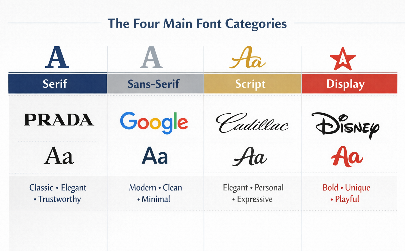
Not all fonts are created equal—and for logo work specifically, understanding the core categories saves you hours of trial and error.
Serif fonts carry authority, tradition, and trust. They’ve been used by legal firms, financial institutions, luxury brands, and publishers for centuries. Think Vogue, Harvard, Rolex. If a brand needs to signal that it has been around and knows what it’s doing, serif is often the instinctive call. But modern serifs—with higher contrast and refined spacing—can feel just as fresh as any sans-serif.
Sans-serif fonts communicate clarity, modernity, and accessibility. They dominate tech, healthcare, and consumer apps for a reason—they’re readable at any size, on any screen. But “sans-serif” is a huge category. A geometric sans (think circles and straight lines) feels very different from a humanist sans (which has warmth and organic rhythm).
Display and decorative fonts are for brands with a strong, specific personality. They make immediate impact but sacrifice versatility—which is fine for a logo, as long as the brand has a companion typeface system for body copy and UI.
Script and handwritten fonts signal warmth, craft, and individuality. Used well, they’re incredibly distinctive. Used carelessly, they’re the typographic equivalent of Comic Sans—charming in the wrong context.
The best fonts for logo design sit precisely at the intersection of the right category and the brand’s specific personality. That sweet spot is worth hunting for.
The Technical Criteria Most Designers Skip
Personality alignment is step one. But a logo typeface also has to work—across every context it will ever live in.
Run every shortlisted font through these practical tests before you commit:
Scalability. Does the font hold up at 12px on a mobile screen and at 10 feet tall on a storefront? Some display fonts with fine hairlines or intricate details collapse completely at small sizes. Always test small.
Distinctiveness at speed. Logos are processed in milliseconds. Does the wordmark read instantly, or do letters blur together? Pay special attention to similar-looking character pairs: I and l, O and 0, rn and m.
Versatility across formats. The logo will appear on a website favicon, a business card, an app icon, an embroidered polo shirt, and a trade show banner. Does the font survive all of those without special treatment?
Weight range. A font with multiple weights gives you flexibility across the brand system—even if the logo itself uses only one weight, knowing the family is available means consistent typography from day one.
Case study: When Google switched from its original custom wordmark to the current rounded sans-serif in 2015, the decision was driven almost entirely by technical criteria—specifically, the need for a typeface that functioned across every device and interface in Google’s expanding ecosystem, from a 4-inch phone screen to a 75-inch smart display. The playful, friendly personality was a bonus. The cross-platform performance was the requirement.
Three Logo Fonts from Indotype Worth Serious Consideration
Finding the right font for a logo means finding something with both the right personality and the technical backbone to perform everywhere. Here are three from indotype.com that consistently deliver on both fronts:
Aurlionex Grotesque — A refined geometric sans-serif with just enough warmth to avoid feeling cold. Excellent for tech startups, fintech brands, and modern professional services. Strong across all sizes, with a weight range that scales naturally into a full brand system.
Lunareth Serif — A high-contrast contemporary serif with the authority of a classic and the freshness of a modern redesign. Built for premium brands, creative agencies, and any identity that needs to signal craft and longevity. Holds beautifully at both display and smaller lockup sizes.
Trivane Display — A confident, personality-forward display font for brands that refuse to be ignored. Perfect for lifestyle, hospitality, fashion, and entertainment brands where memorability matters more than neutrality. Comes with extended commercial licensing for full brand deployment.
Each of these fonts ships with commercial licensing that covers logo use, brand systems, web, print, and packaging—everything a real-world branding project demands.
Conclusion: The Right Typeface Is a Brand Decision, Not a Style Decision
Choosing fonts for logos is one of the highest-leverage creative decisions in any branding project. Get it right and the entire identity feels effortless. Get it wrong and no amount of clever iconography or color work can fully compensate.
Start with personality. Validate against technical requirements. And choose fonts that are built for the demands of professional brand deployment—not just beautiful in a preview window.
Ready to find the typeface that defines your next logo? Explore our full collection of commercial-grade logo fonts at indotype.com and build something worth remembering.