
Font Preview
Description
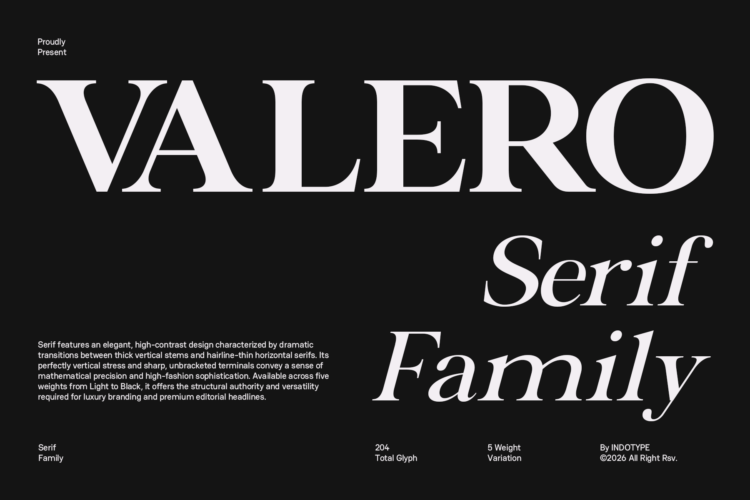
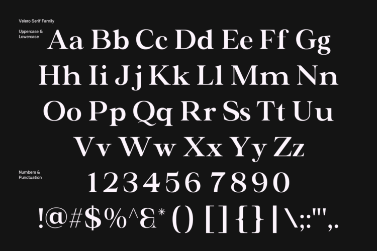
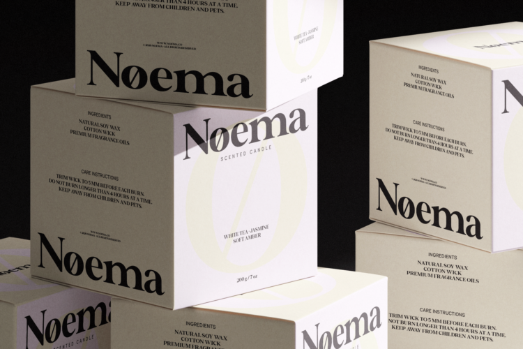
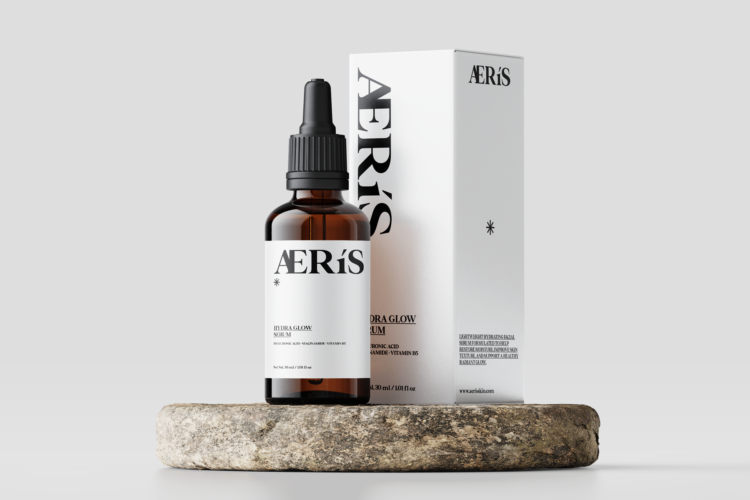
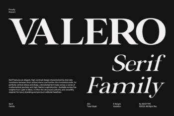
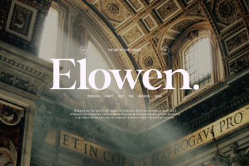
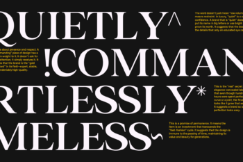
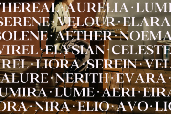
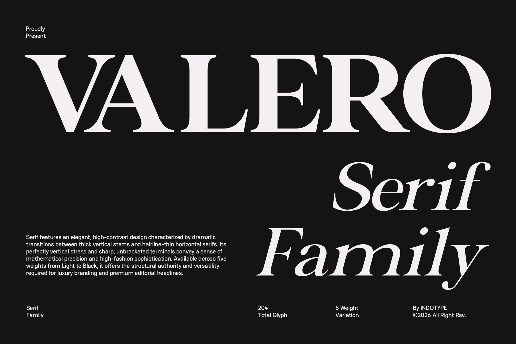
Valero is a high-contrast classic serif typeface designed for luxury branding, premium editorial design, and high-fashion visual communication. Crafted by INDOTYPE, Valero draws from the tradition of rational, neoclassical serif typography while pushing into bold contemporary territory. Its dramatic stroke contrast — with thick vertical stems paired against hairline-thin horizontal serifs — creates a visual tension that commands attention at any scale.
- Design Characteristics
Valero’s letterforms are built on a foundation of perfectly vertical stress, giving the typeface a mathematical exactness that reads as authoritative and self-assured. The sharp, unbracketed serifs — narrow and geometric — reinforce its high-fashion sensibility, echoing the aesthetic codes of luxury couture and premium publishing. The generous x-height ensures excellent legibility in both display and subheading applications, while the open counters maintain clarity even at smaller sizes. Optically refined character spacing and carefully balanced proportions make Valero a versatile performer across print and digital mediums. Each glyph has been drawn to feel simultaneously timeless and contemporary — a serif that belongs equally in a Vogue editorial spread and a modern tech brand’s annual report.
- Weights & Styles
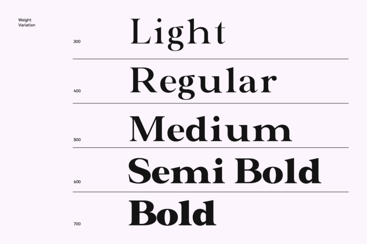
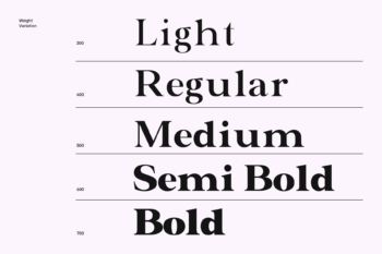
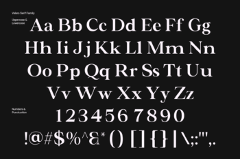
The Valero Serif Family is available in 5 weights: Light, Regular, Medium, SemiBold, and Bold — spanning a broad tonal range from delicate editorial refinement to commanding display impact. Each weight is accompanied by an italic variant, expanding the family’s expressive range for subheadings, captions, pull quotes, and decorative typesetting. With 204 total glyphs per style, Valero supports comprehensive Latin character coverage including standard punctuation, currency symbols, ligatures, and diacritical marks — making it suitable for multilingual publishing across Western European languages.
- Ideal Use Cases
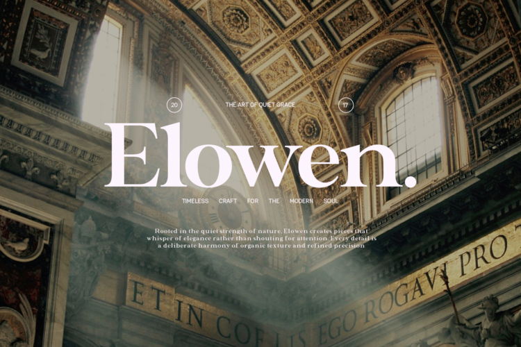
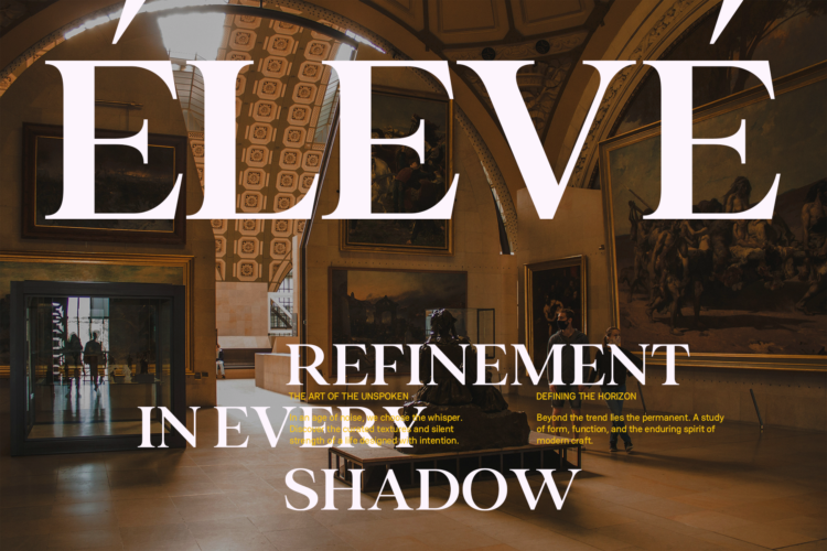
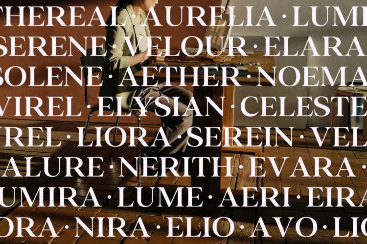
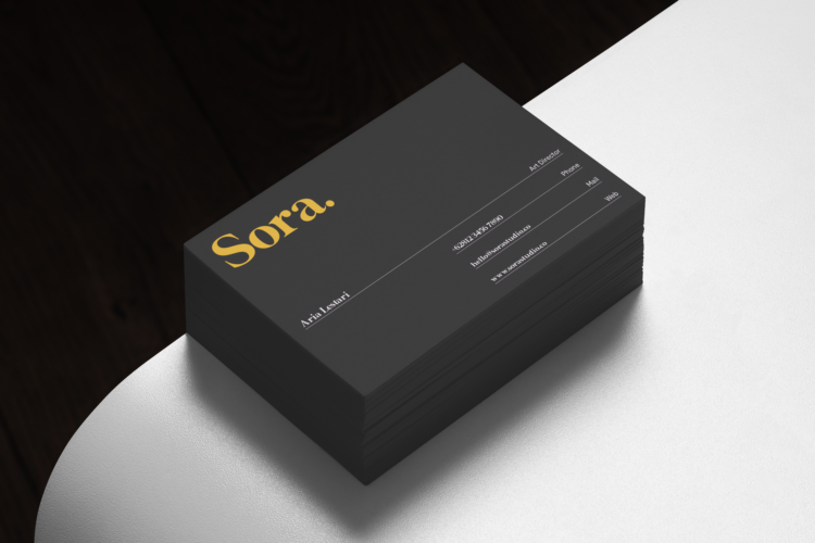
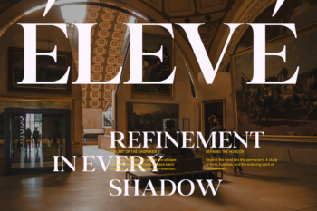
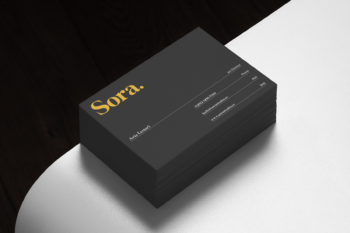
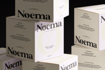
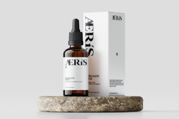
Valero is engineered for applications where typographic elegance is non-negotiable. It excels in: luxury and fashion brand identities, magazine and editorial headlines, book cover design, packaging for premium consumer goods, high-end invitations and stationery, and digital brand experiences for lifestyle, beauty, and hospitality sectors. The heavier weights (Bold and Black) are particularly striking for display headline applications where visual impact is paramount. The Light and Regular weights perform gracefully in subheading and caption roles, creating elegant typographic hierarchies when paired with clean sans-serif body text.
A SUMMARY OF WHAT’S INCLUDED:
- Standard Character A-Z, a-z, 0-9, Punctuation & symbols
- Thin, Regular, Medium, Semi Bold, Bold Weight Styles and Italic Style on Each Weight
- Multilingual Support accents and diacritics
- Including Alternate Glyphs
- Three different format fonts (OTF, TTF, WOFF)*
- Works on PC & Mac
- Simple installation
- Accessible in Adobe Creative Suite (Ai, Ps, Id, etc.) even work on Microsoft Word.
- PUA Encoded Characters – Fully accessible without additional design software.
🌟If you come across any issues or notice anything we might have overlooked while using this product, please feel free to reach out to us. We greatly value your feedback as it helps us enhance and refine our products. Thank you!
*The font format you receive depends on the license you purchase.
Additional information
| License Type | Desktop License, Web Font License, E-Publishing License, Monetized Social Media & Digital Ads License, Logo License, Extended License, App or Game License, Server License, Video & Broadcast License, National Corporate License, Worldwide Corporate License |
|---|

Reviews
There are no reviews yet.