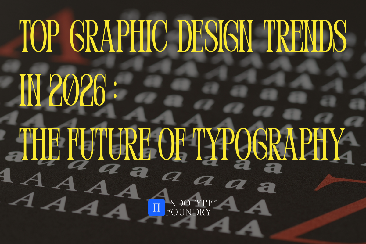
Top Graphic Design Trends in 2026: The Future of Typography
 Is your brand starting to look a little too… perfect? In 2026, the design world is hitting a fascinating turning point. After two years of being flooded with ultra-polished, AI-generated visuals, audiences are experiencing “digital fatigue.” The result? A massive shift toward Human-Centered Design and Generative Symbiosis. For designers, marketers, and developers, 2026 isn’t just about making things look good; it’s about making them feel real.
Whether you’re building a sleek SaaS platform or a boutique lifestyle brand, your choice of typography is no longer just a supporting act—it’s the main character. From kinetic variable fonts that respond to user emotion to the revival of “imperfect” hand-drawn scripts, the fonts for 2026 design trends are all about personality and presence. In this article, we’ll dive into the four major movements shaping the visual landscape this year and how you can use premium fonts from Indotype to stay ahead of the curve.
1. Generative Symbiosis: When AI Meets Human Craft
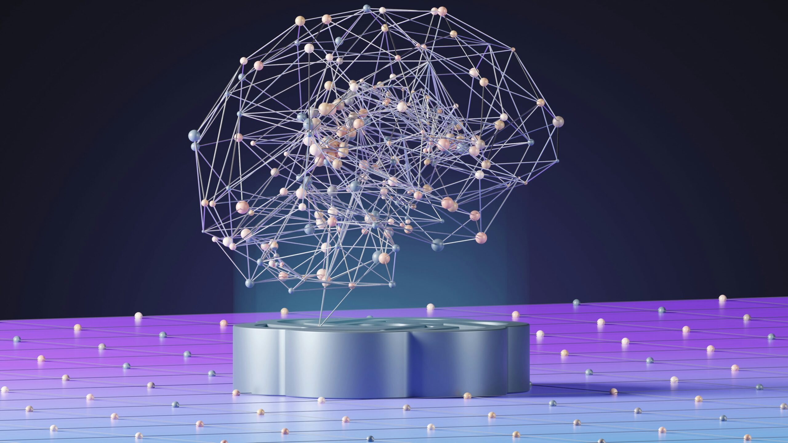
The “AI vs. Human” debate of 2024 is officially over. In 2026, we’ve entered the era of Generative Symbiosis. Designers are no longer just using AI to generate images; they are using it as a collaborative partner to push the boundaries of what’s possible.
The trend here is “AI-informed, Human-refined.” We’re seeing a rise in Variable Kinetic Typography—fonts that don’t just sit on a page but breathe, stretch, and react to a user’s scroll or cursor movement. This creates an immersive experience that feels alive.
Surprising Fact: According to recent industry reports, over 75% of high-converting landing pages in 2026 now utilize variable fonts to improve both load times and user engagement.
To nail this look, you need a typeface that is engineered for flexibility. Our Fortusnova is a perfect example—a neo-grotesque powerhouse that making it ideal for the responsive layouts of 2026.
2. “Imperfect by Design”: The Return of the Human Touch
As AI gets better at producing flawless geometry, humans are gravitating toward the flawed. The “Imperfect by Design” movement is a creative rebellion against algorithmic perfection. Think of it as the “Zine Aesthetic” grown up—it’s raw, honest, and tactile.
This trend manifests in:
-
Ink-Trap Details: Amplifying the functional notches in letters into bold, stylistic features.
-
Tactile Textures: Fonts that look like they were pressed into paper, carved into stone, or written with a shaky hand.
-
Bouncy Serifs: Moving away from rigid grids toward fluid, organic shapes that feel friendly and unpretentious.
If you’re working on a brand that needs to build deep trust, like wellness or artisanal products, steer clear of the cold “blandified” sans-serifs of the past decade. Instead, try Minerva, a high-contrast serif that balances classic elegance with the subtle “impurities” that signal authenticity.
3. Liquid Glass and 3D Typography
3D design has been around for years, but 2026 has refined it into something much more sophisticated: Liquid Glass. Thanks to improved browser rendering, we are seeing typography that looks like it’s made of molten glass, chrome, or translucent wax.
This isn’t just about adding a drop shadow. It’s about Typographic Maximalism, where the letters themselves become sculptural objects. We are seeing these “liquid” fonts paired with Bento Grid layouts—neatly organized boxes that contain chaotic, high-energy 3D elements.
For a futuristic, tech-forward vibe that feels cinematic, look at Slurvia. Its a liquid-like terminals are designed to catch digital “light,” making your headers pop off the screen in a way that feels 100% 2026.
4. Neo-Nostalgia: The ’70s and ’90s Remix
Nostalgia is still a powerhouse, but in 2026, we’re remixing it. We’ve moved past simple Y2K aesthetics into a blend of 70s Psychedelia and 90s Rave Culture, updated with modern accessibility standards.
The “Mutant Heritage” trend takes classic, old-school typefaces and “hacks” them with modern proportions. We’re seeing chunky, funky curvy serifs (think of the recent Adobe and Eventbrite rebrands) that feel cozy and optimistic.
-
Pro Tip: Pair a bold, funky serif headline with a very clean, wide-spaced sans-serif for body text. This creates a “Quietly Loud” balance that is very popular in editorial design right now.
Looking to capture that groovy yet professional energy? Check out Booflin, a typeface that brings the warmth of the ’70s into the digital age without losing legibility.
Conclusion: Designing for the New Era
The graphic design trends of 2026 prove one thing: audiences are looking for connection, not just content. Whether you choose the interactive power of variable fonts or the soulful charm of “imperfect” lettering, your typography is the bridge between your brand and your community.
As we move further into this year, remember that the most successful designs will be those that balance technological innovation with human emotion. Don’t be afraid to break the grid, add some texture, and let your brand’s unique voice shine through.
Ready to future-proof your design toolkit? Grab these trending fonts now at indotype.com and elevate your designs to the 2026 standard!