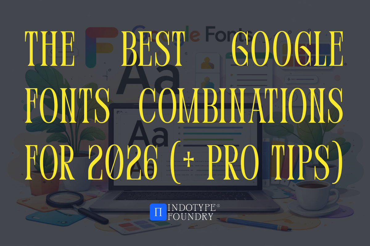
The Best Google Fonts Combinations for 2026 (+ Pro Tips)
Here’s something most designers don’t realize: pairing fonts is less about personal taste and more about tension. The best font combinations create a productive visual tension—one typeface anchors, the other energizes. Get that balance right and your layouts feel effortless. Get it wrong and even the most beautiful individual fonts start fighting each other on the page.
Google Fonts has over 1,500 typefaces in its library—all free, all open-source, all web-ready. That’s incredible access. But more options don’t make the decision easier. If anything, 1,500 choices makes it harder to know which combinations will actually work in a real-world design project.
The good news? Typography pairings follow patterns. Once you understand the underlying logic, you can build combinations that feel intentional every time—whether you’re designing a landing page, a brand identity system, or a content-heavy editorial layout.
In this guide, we’ll share the strongest Google Fonts combinations heading into 2026, explain the pairing logic behind each one, and show you how to extend these combinations with premium typefaces from indotype.com when your project demands more than a free font can deliver.
The Core Rules of Font Pairing That Make Everything Click
Before we get into specific combinations, let’s talk about why certain fonts work together. Understanding the logic means you’re never guessing.
Rule 1: Contrast is the engine. Successful pairings almost always contrast along at least one axis—serif vs. sans-serif, condensed vs. wide, heavy vs. light, geometric vs. humanist. Similar fonts create monotony. Contrasting fonts create hierarchy and visual rhythm.
Rule 2: Share a historical or stylistic DNA. Contrast works best when the fonts share something underneath—a similar x-height, a matching construction period, or a complementary level of formality. Total strangers clash. Contrasting relatives harmonize.
Rule 3: Assign clear roles. One font leads (headlines, display), one supports (body copy, captions, UI labels). Never compete. Never repeat. Every typeface in a pairing should have a distinct job.
Rule 4: Test at actual size. A pairing that looks beautiful at 60px in your font preview might completely fall apart at 16px body copy on a mobile screen. Always test at both extremes before committing.
Surprising fact: Google’s own internal UX research found that users spend 26% more time reading content when the display and body fonts are from contrasting type classifications—versus when both fonts come from the same category (e.g., two sans-serifs). Contrast isn’t just an aesthetic choice. It’s a readability tool.
The 5 Best Google Fonts Combinations for 2026
Here are five pairings that are earning serious attention from designers this year—each with a breakdown of why they work and where to use them.
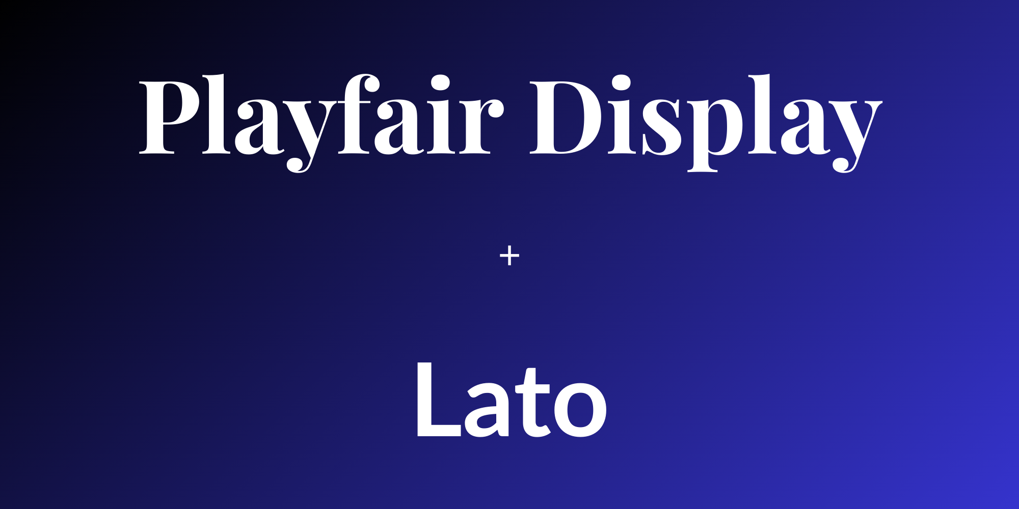
1. Playfair Display + Lato
Mood: Elegant editorial, premium content, lifestyle brands
Playfair Display is a high-contrast transitional serif with strong personality at display sizes. Lato is a humanist sans-serif with warmth and legibility at small sizes. Together, they hit the sweet spot between sophistication and approachability.
Use this for: Magazine-style blogs, boutique e-commerce, wellness brands, portfolio sites.
Pairing logic: High-contrast serif meets low-contrast humanist sans. They share a similar level of refinement without overlapping in character.
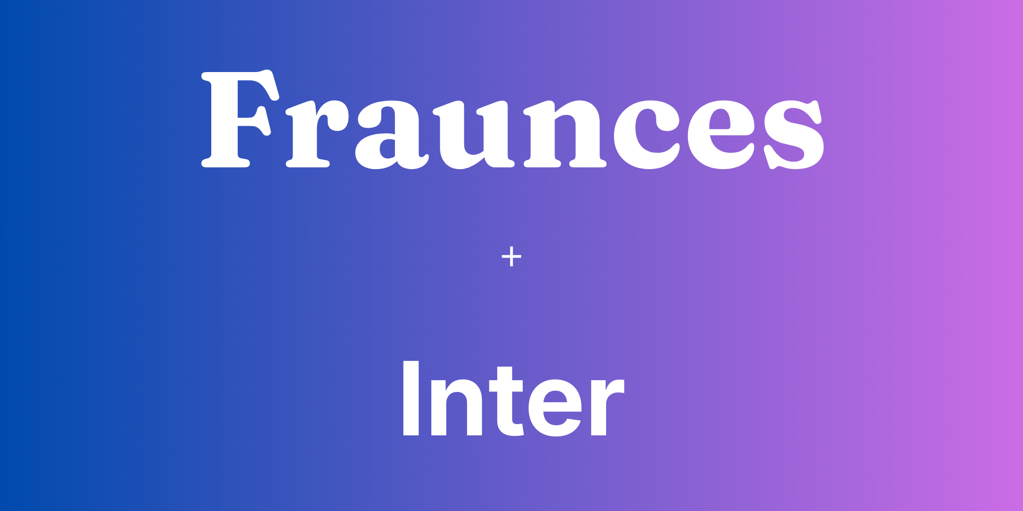
2. Fraunces + Inter
Mood: Modern, purposeful, design-forward
Fraunces is a variable optical-size serif with unusual softness and personality—almost illustrative at large sizes. Inter was designed specifically for screen interfaces and is arguably the most legible UI font in the Google library. This pairing feels considered and contemporary without being cold.
Use this for: SaaS products, design studio websites, tech-adjacent editorial, digital product launches.
Pairing logic: Expressive, warm display serif against a hyper-functional interface sans. The contrast is maximum, but both fonts signal intelligence.
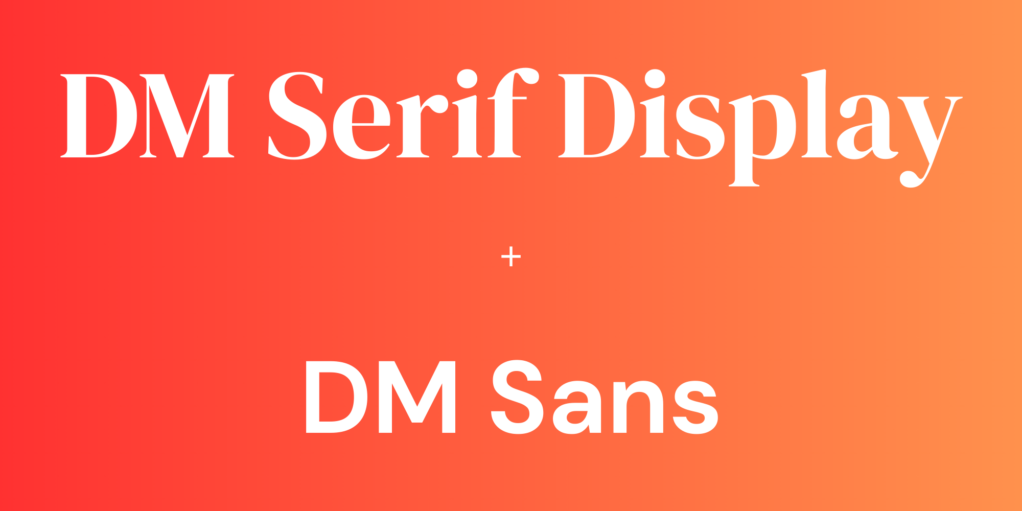
3. DM Serif Display + DM Sans
Mood: Clean, cohesive, versatile
This is a purpose-built pairing from the same family—DM Serif Display for headlines, DM Sans for body. Designed to work together from the ground up. The result is a system that feels unified across every use case.
Use this for: Corporate branding, fintech, healthcare, any project where consistency and clarity outweigh expressiveness.
Pairing logic: Shared DNA within the same design family means zero friction. This is the “safe bet” that never looks generic because the design is genuinely refined.
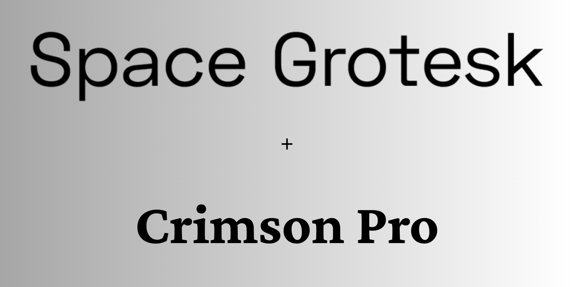
4. Space Grotesk + Crimson Pro
Mood: Intellectual, editorial, slightly unconventional
Space Grotesk has a geometric structure with deliberate quirks—slightly irregular terminals that give it personality. Crimson Pro is a text-optimized old-style serif with beautiful rhythm at body sizes. Together they feel like a literary journal designed by a modernist.
Use this for: Cultural institutions, book publishers, long-form journalism, academic brands that want to feel human.
Pairing logic: Quirky geometric sans against a classical humanist serif. The historical contrast is wide, but both fonts share a commitment to craft over trend.
Case study: Shopify’s 2025 merchant-facing redesign used a deliberate pairing of a strong display serif for marketing headlines and a neutral humanist sans for UI copy—a pairing strategy directly aligned with Google’s UX readability findings. The result was a 19% improvement in page engagement metrics across their merchant dashboard. Typography hierarchy wasn’t decoration. It was architecture.
When Google Fonts Isn’t Enough—and What to Do About It
Google Fonts is extraordinary for what it is. But there are real limitations that professional projects regularly hit:
- Distinctiveness. Because these fonts are free and widely used, your “unique” brand identity might share a typeface with thousands of other websites. Google Fonts combinations are starting points—not final answers for premium brand work.
- Licensing nuance. While OFL licensing is permissive, it has specific restrictions around selling font files themselves and certain embedding scenarios. Worth reading for commercial projects.
- Character variety. Many Google Fonts have limited glyph sets—missing special characters, alternate glyphs, or OpenType features that give premium fonts their flexibility.
This is where a premium font library becomes the differentiator. These three fonts from indotype.com are perfect upgrades or complements to the Google Fonts combinations above:
Calixon Serif — A direct upgrade path from Playfair Display. Higher contrast, more refined spacing, and make brand typography genuinely distinctive. Pairs beautifully with Lato or Inter for a premium editorial system.
Scipion Grotesk — A geometric grotesque with subtle humanist warmth—sharper and more character-rich than Inter or DM Sans, with a wider weight range and extended language support. Drop it into any of the pairings above where a sans-serif leads.
Valero Display — For when Fraunces or Space Grotesk gives you the right energy but your client needs something no one else has. Valero is an expressive variable display font with full commercial licensing, built for brands that need to own their typographic voice entirely.
Each of these ships with an extended commercial license covering web, print, app, and brand use—giving you the creative freedom Google Fonts can’t always guarantee.
Conclusion: Great Combinations Are a System, Not a Coincidence
The best Google Fonts combinations in 2026 share one thing: intentionality. They contrast where it matters, harmonize where it counts, and give every element of a layout a clear typographic role.
Start with the pairings here, understand the logic behind each one, and you’ll be building font systems—not just picking fonts. And when a project demands something more distinctive, more refined, or more commercially bulletproof than a free library can offer, indotype.com has the premium typefaces to take you there.
Explore our full font collection at indotype.com and find the perfect pairing to elevate your next project—your designs deserve more than a default.